Client:
Problem: Re-establishing and separating the high-end custom home development and renovation division from their commercial importing division. Over the years they focused on commercial work which was done through direct client channels and their residential facing brand began fading to competition.
Solution: We re-positioned Mergem back to their roots of beautiful custom residential work. Attention was focused on sharing the journey of a small business, creating brand character and using personality to develop trust and a creative connection with potential clients.
Services: Branding & Identity • Logo Design • Web Design • Web Development • Graphic AD Design • Copywriting
Defining the brand creates an objective roadmap, like a filter for the company’s marketing direction. By structuring this, we could quickly see whether any decisions will help or hurt, focus or muddy, purify or modify the brand.
We conducted an in-depth strategy session. What emerged was a clear brand story and voice for Mergem. Their customers were spending significant budgets on works of art that would bring their visions to life.
By creating a small, friendly atmosphere, we were able to use Mergem's relatively small size to their advantage. Focusing on a dynamic of exclusivity and client prioritization we were able to make the customer experience feel like a safe, but exciting journey.

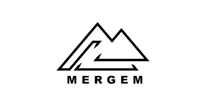
Mergem represents a firm of fine craftsmanship, design innovation and precision. We started by placing one triangle within another to create twin peaks, representative of natural mountains or the M for Mergem. Within, we incorporated the I for International through a series of precise lining. Pulled together the logo embodies the firm and their ability to incorporate identity into sharp, crisp designs.

Inhous developed an entire identity system to make sure every customer touch-point reflected the brand. The rebrand included brochure magazines showcasing case studies & building trends, catalog books and a building banner. We introduced a new color palette, a new typeface and wooden-style design elements. This created a more cohesive experience and atmosphere for both the physical branding and digital extensions.
